
Building a Custom Form
A Custom Form is a form you design yourself, from scratch, to match a document your team already uses — a Job Safety Analysis, a sign-in sheet, an inspection checklist, and so on. You lay it out in a drag-and-drop builder: add sections, drop in fields, arrange them on a grid, and set how the printed PDF looks. Once you publish it, the form becomes a template that people on your team can fill out and submit. This article walks through building one; filling out and assigning a form is covered separately.
Building forms is an admin task — you'll need administrator access to see the builder.
Open the builder
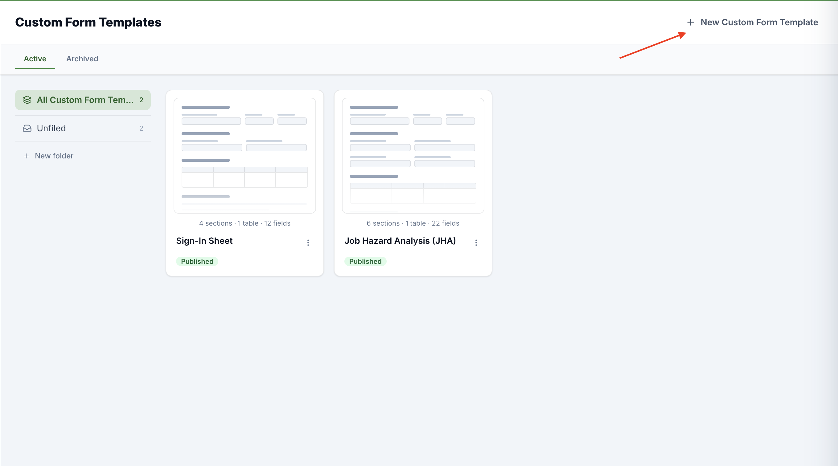
In the left navigation, open Custom Form Templates. (The Custom Forms item just above it is the list of forms people have already filled out — the templates area is where you design them.)
Click New Form in the top-right corner.
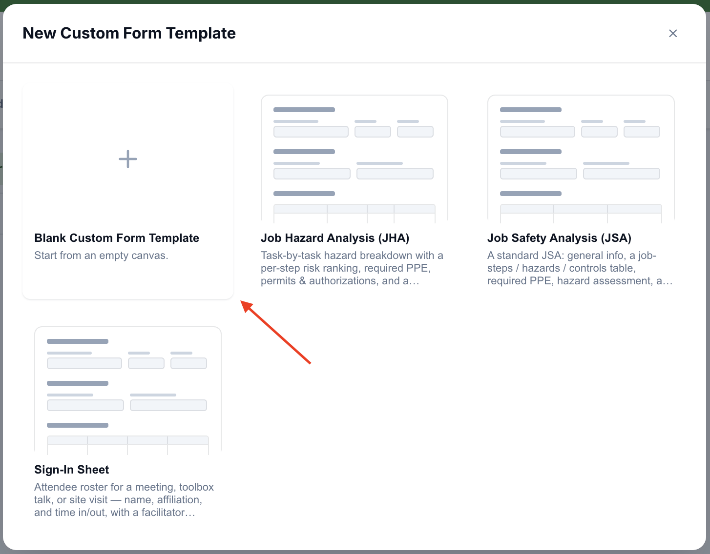
In the New Form window, choose how to start:
Blank form — Start from an empty canvas.
A sample — pick one of the ready-made starters (such as Job Safety Analysis, JHA, or Sign-In Sheet). A sample gives you a complete, working layout you can adjust instead of starting from nothing.
Either choice opens the builder immediately. A blank form starts life named Untitled Form and in Draft state — nothing is visible to your team until you publish.
Name the form and set up the page
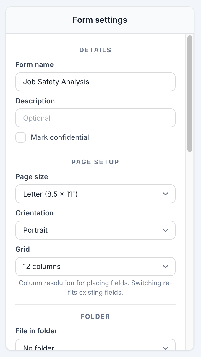
The Form settings panel runs down the left side of the builder (use the Settings button in the top bar to show or hide it). Start at the top:
Details — give the form a Form name (e.g. Job Safety Analysis) and an optional Description. Turn on Mark confidential if the form's contents should be treated as sensitive.
Page setup — this controls the printed PDF. Choose a Page size (Letter (8.5 × 11") or A4), an Orientation (Portrait or Landscape), and a Grid of either 12 columns or 24 columns. The grid is the resolution you place fields on — 24 columns lets you make finer width adjustments. Switching the grid re-fits your existing fields automatically.
Understand the three regions
Every form has three stacked regions, and they behave differently on the printed page:
Header — Repeats at the top of every page. A running band for identity fields (site, date, supervisor).
Body — Flows and paginates. This is the main content of the form and the only region that spills onto additional pages.
Footer — Repeats at the bottom of every page.
The header and footer are running bands: because they reprint on every page, they must stay short. Each holds a single section, only short single-line fields are allowed (no paragraphs, signatures, photos, tables, or multi-select), and rows are capped (up to 3 in the header, 2 in the footer). Put the substance of your form in the Body.
One more thing to expect: the printed form leads with a cover page (title, summary, and description) — the header, body, and footer begin on page 2.
Add sections
Within a region, content is grouped into sections. Use the add bar inside a region:
Add body section (or Add header section / Add footer section) — a plain section that holds fields.
Add table section — a repeatable table, available in the body only (see Table sections below).
Give each section a title in the Untitled section field at its top. The section's menu (the … in its corner) offers Duplicate, Convert to table / Convert to section, and Delete section. (Duplicate and Convert are hidden inside the header and footer bands, since those hold just one section.)
Add and arrange fields
Click Add field at the bottom of a section. A new field appears and its configuration panel opens on the right.
Move a field by dragging its tile, and resize it by dragging the handle on its right edge — the field snaps to the grid columns. A numbered ruler above the section shows the column positions, and faint guides appear while you drag.
Arrange fields side by side by making them narrower and dropping them on the same row.
Some field types have a minimum width — signatures, photos, and date/time pickers need room to stay legible on paper, so the builder won't let you shrink them below their floor (and will widen them to fit if needed). If a type won't fit where you're trying to put it, you'll see a message telling you to make more room.
Configure a field
Select any field to open its configuration panel. The controls, top to bottom:
Label — what the field is called (e.g. Job step).
Type — the kind of field. Types are grouped in the picker (see the reference below).
Required — check this if the field must be answered before the form can be submitted.
Choices — for Dropdown, Multi-select, Radio, and Checkbox fields, list the options a respondent picks from (Add choice for each).
Who can sign — for a QR sign field, Employees, in the mobile app (people scan the code in the mobile app and pick themselves from the roster, or type a visitor's name) or Anyone with a phone camera, no login (the printed code opens a page where the signer types their name and signs — no account needed). The first option uses your workspace's own name for Employees.
Allow per-field — let people attach extra detail to their answer: Attachments, Notes, and a Corrective Action. (The Corrective Action label reflects your workspace's own naming.)
Visibility — keep a field Always visible, or Show only when… another answer meets a condition (see below).
Field types
Fields are grouped by family in the Type picker:
Text — Text (a single line), Paragraph (multiple lines), Money, Address.
Choice — Dropdown, Multi-select, Radio, Checkbox, Yes / No.
People — Person (pick one employee), Personnel (pick several).
Date & time — Date, Date & time, Time.
Signature & media — Signature, Signatures (many on one field, like a sign-in sheet), QR sign (collect signatures by scanning a QR code — Who can sign, above, sets whether that takes the mobile app or any phone camera), Photo.
Display only — Text block (a paragraph of static instructions) and Header (a bold label). These carry no answer — the text you type is the content.
Show or hide a field based on an answer
Conditional visibility lets a field appear only when it's relevant. In a body field's Visibility section, choose Show only when…, then build one or more conditions: pick a controlling field, a comparison (is / is not, or includes / doesn't include for multi-answer fields), and a value. Add more with + AND / + OR; conditions are checked top to bottom.
Two rules to keep in mind: conditional visibility is available on body fields only, and a field can only depend on a field that appears before it in the form. That's why the builder stops you from dragging a controlling field below the field it controls.
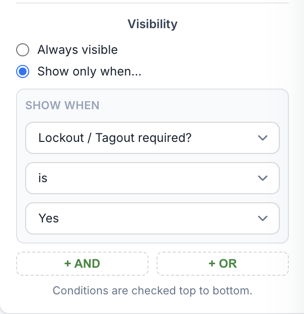
Table sections (repeatable rows)
A table section captures a repeating set of entries — one row per hazard, per attendee, per step. Building one has three parts:
Columns — use Add column to define the fields that make up each row. Columns share one horizontal band, so their widths add up across the grid.
Header rows — optional rows printed above the entries. With none, the column labels print as the header (No header rows — column labels print as the header.).
Entry row — the row that repeats per entry on fill. Set Min entries and Max entries to bound how many rows a person can add.
Signatures, photos, and QR sign can't go inside a table.
Number your forms (optional)
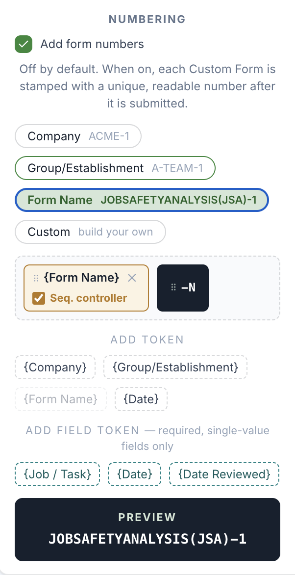
Turn on Add form numbers in the Numbering section to stamp each submitted form with a unique, readable number (it's off by default, and the number is assigned after a form is submitted — so a number always maps to a completed record). Build the pattern from tokens — Company, Group, Form Name, Date, and values pulled from required single-value fields on the form — and drag them into the order you want.
Mark at least one token as a Sequence Controller: the running number (-N) restarts for each unique combination of controller values. For example, with Form Name as the only controller you'd get -1, -2, -3…; add an employee field as a controller and each person gets their own -1, -2… A live Preview shows the result as you build.
Connect, notify, and require approval (optional)
Further down the Form settings panel:
Connection — leave a form Standalone (not connected), or Connect to a host record (such as an Incident) so it can be attached to that record and appended to its PDF. When connected, pick the Stage (Investigation, Action, or Closure) and optionally limit which host types offer the form.
Notifications — choose Recipients to alert, then select which events to notify them about.
Approval — turn on Require sign-off before a submission is complete to route submissions to Approvers. Set the Completion rule (Everyone must approve or Any one approver is enough) and what happens On rejection (Return for revision or Reject and close).
The host record, its types, and the Corrective Action name all reflect your workspace's own naming.
Preview and publish
Click Preview in the top bar at any time to generate the PDF and open it in a new tab (the button reads Generating… while it builds, then Open preview).
Save your work with Save Draft as you go.
When the form is ready, click Publish. If anything needs fixing first, the bottom bar shows how many issues to fix before publishing and the Publish button stays disabled until they're resolved — a matching Fix before publishing list appears in the settings panel. Common blockers: no fields added yet, a numbering pattern missing its sequence number, or a table with no columns.
Publishing makes the form available to your team. From then on, that published version is frozen — to make changes, use New Version (which opens a fresh draft), or Duplicate the form into a separate one. Forms already filled from the old version are unaffected.
Good to know
Keep the header and footer light — they reprint on every page, so only short single-line fields are allowed and rows are capped (3 header, 2 footer).
Signatures, photos, and date/time fields have a minimum width so they stay legible on the printed PDF.
A field's visibility can only depend on a field above it, and only on body fields.
A form number is assigned on submission, not while filling — a pre-submit form shows its number as pending.
Published versions are read-only. Use New Version to edit, or Duplicate to branch off a copy.